


Working as a product designer at dti digital, Portal O Tempo was one of the clients I worked with and one of my first true UX design projects. This was one of the most pleasurable, significant and impactful activities I have ever performed in that company.
At first, I worked with the team to improve the “Meu Perfil” (or My Profile, in English) section of the portal. My Profile consists of a page where the reader or subscriber can receive personalized news and access relevant resources to use the platform. This section was 100% conceived and developed by the team, where I worked together with developers and another designer with whom I split tasks.
In that period, I started with simple changes like relocating buttons. But as I got deeper into the product context, I progressed to tackle more complex demands. You can check the following examples on the side:
- Profile picture changing flow;
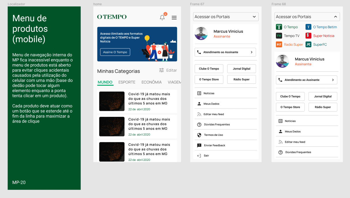
- Mobile version of the product menu;
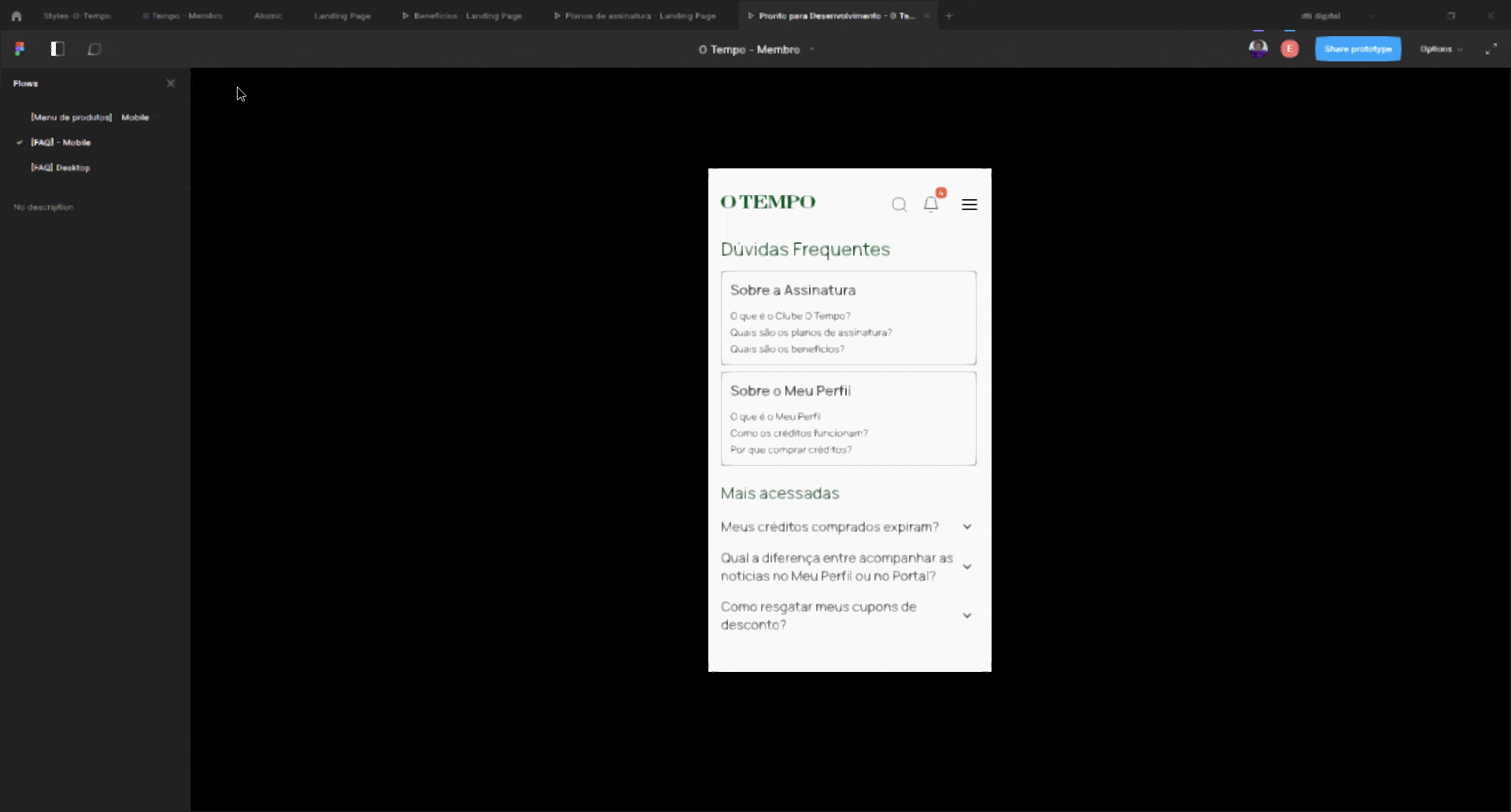
- FAQ page;
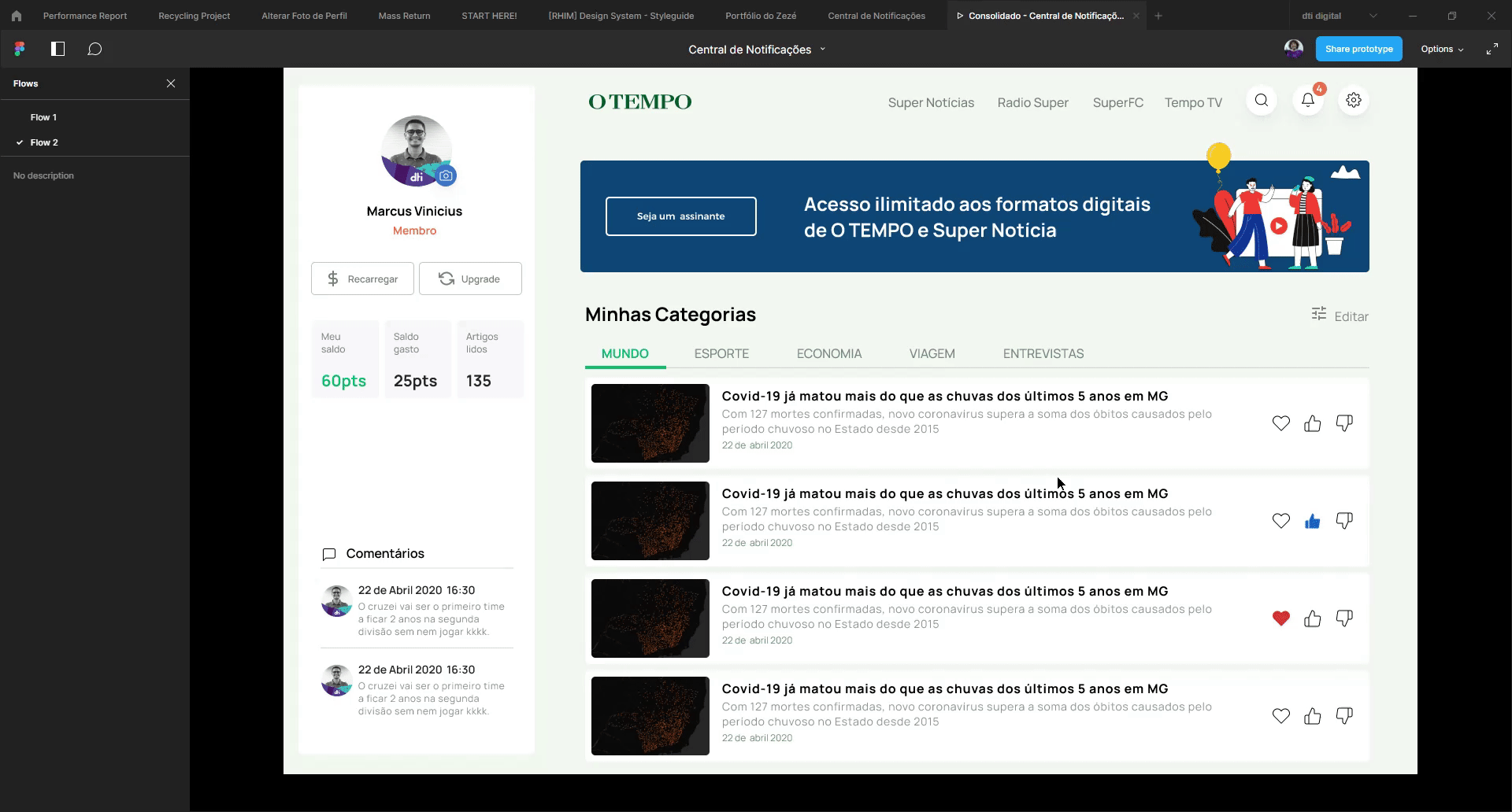
- Notifications panel redesign.


Among the contributions I made in this work, the one I believe had the most positive impact on the company was in the subscription process. With the rising costs of paper for publishing physical newspapers and the ongoing trend of online reading, the stakeholders saw the need to pivot to the digital subscription format instead.
However, several factors made it difficult for the customers to adhere to this change and the company needed to know how to act to improve its conversion rate. We looked at the conversion metrics and saw that it was common for the business, despite its notoriety, to go several days with no new subscribers, which is concerning for a company of their size. At that moment, part of our team and I worked alongside the sales team and, thus, I was able to coordinate a continuous discovery journey that clarified and helped solving some of the issues encountered.
The first step to identify possible issues was the use of heatmaps and screen recordings that brought to light several navigability flaws and overall confusion present on the subscription page. In addition, we scrubbed through the results of a survey form sent a few months earlier and noticed people saying it’s hard to understand the product and its pricing model.
Then, with the intention of revamping the pricing page, we decided to review the subscription plans to streamline the tiers and reduce the number of plans. What used to be three planes — “Digital Unlimited”, “Digital Fan” and “Print + Digital + Gift”, in simple translation — caused misunderstanding and therefore was condensed into two plans: “Digital Unlimited” and “Print + Digital”. Of these two, we highlighted the first one, as it was cheaper for the user and more profitable for the business.
By redesigning the page, we sought to make the benefits of the subscription clearer and highlight the “Digital Unlimited” plan. After launch, we decided to perform A/B testing and continue recording visitor heatmaps and screen recordings. As a result, the page remained in constant evolution after testing.
The result was a more than fourfold increase in the number of people who landed on the checkout page, and the conversion rate rose from 15% to 25% when comparing the two pages over the same period during an A/B test.
Finally, we sent a new survey form to find new issues in which we could expand our discovery process. With over a thousand responses, I metrified some of the data and extracted relevant nuggets to bring up new changes. Unfortunately, my stay with the Portal O Tempo team ended (due to internal dti digital reallocations) before I could see these latest efforts bear fruit, but you can check out the work through this link (in Portuguese, unfortunately).
